The Bento layout guide
This guide explains how to effectively layout Bento components.
Background: how to avoid content shifts
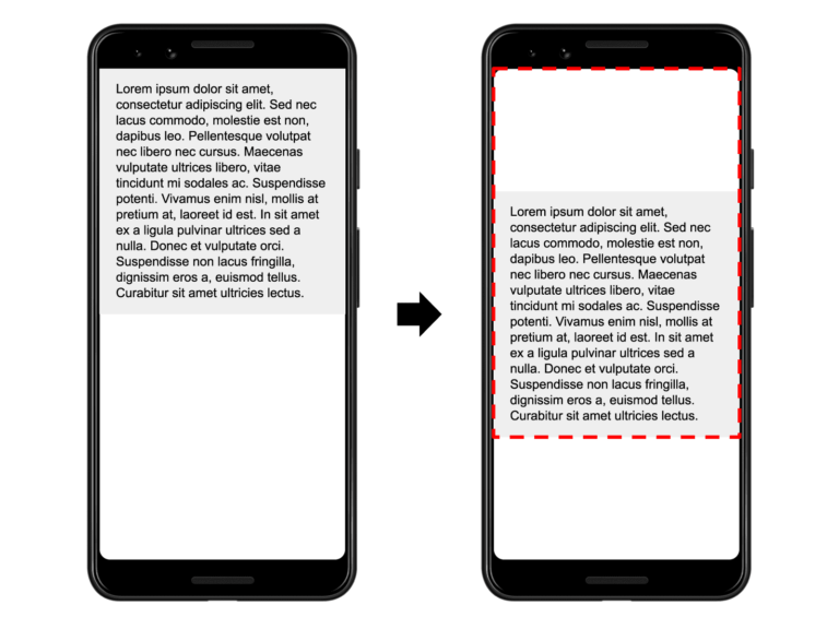
Content shifts are annoying and avoiding content shifts is an important part of providing a good user experience. Content shifts are also part of the core web vitals are measured via the CLS metric. The key to avoiding content shifts is to correctly layout the content of your webpage on page load.
Bento components are optimized to avoid content shifts. This is also why every Bento webcomponent brings its own CSS styles. These styles ensure that Bento components are laid out correctly on page load.
<script
  async
  src="https://cdn.ampproject.org/v0/bento-accordion-1.0.js"
></script>
<link
  rel="stylesheet"
  type="text/css"
  href="https://cdn.ampproject.org/v0/bento-accordion-1.0.css"
/>
But some components require additional information about how they should be laid out on page load. For example, the carousel requires a pre-defined height (which can be relative to the viewport size), which you can define via CSS.
In this guide, we will introduce several common layouts that work great with Bento components (and outside of Bento as well). However, not every layout works with every Bento component. For example, the container layout approach works great for the Bento Accordion, but not for the Bento Carousel.
So, let’s get started and lay out some Bento components!
Layouts
Container layout
The easiest layout is the container layout. This means that the Bento component is sized based on the size of its children and does not require additional information:
<bento-accordion>
  <section>
    <h2>Section 1</h2>
    <div>Content in section 1.</div>
  </section>
  <section>
    <h2>Section 2</h2>
    <div>Content in section 2.</div>
  </section>
</bento-accordion>
Fixed layout
The fixed layout is another simple layout approach for bento components. With a fixed layout, the element retains its fixed dimensions based on the element's width and height attributes:
<bento-base-carousel style="width: 400px; height: 300px">
  <div class="red"></div>
  <div class="blue"></div>
  <div class="green"></div>
</bento-base-carousel>
Of course, this doesn’t mean that the size is not responsive. You can also dynamically size your element using percentages or viewport dimensions:
<bento-base-carousel style="width: 50vw; height: 50vh">
  <div class="red"></div>
  <div class="blue"></div>
  <div class="green"></div>
</bento-base-carousel>
Fill layout
With a fill layout, the element takes the space available to it—both width and height. In other words, the layout and size of a fill element matches its parent. Here is how you define a fill layout rule:
<style>
  .fill {
    position: absolute;
    top: 0;
    left: 0;
    right: 0;
    bottom: 0;
    width: 100%;
    height: 100%;
  }
</style>

<div style="width: 400px; height: 300px; position: relative;">
  <bento-base-carousel style="fill">
    <div class="red"></div>
    <div class="blue"></div>
    <div class="green"></div>
  </bento-base-carousel>
</div>
Important: for this to work, the parent container needs to define position: relative.
Fixed height layout
With a fixed-height layout, the element takes the space available to it but keeps the height unchanged. This layout works well for elements that need to position content horizontally (e.g., bento-base-carousel). The layout is defined by specifying the element’s width and height: width: 100%; height: 300px:
<bento-base-carousel style="width: 100%; height: 300px">
  <div class="red"></div>
  <div class="blue"></div>
  <div class="green"></div>
</bento-base-carousel>
Responsive layout
With a responsive layout, the element takes the space available to it and resizes its height automatically to the aspect ratio specified by the element's width and height attributes.
The new aspect-ratio CSS property makes this very easy to declare in CSS:
<bento-fit-text style="aspect-ratio: 4 / 3"> Hello world! </bento-fit-text>However, for maximum browser compatibility it’s best to fallback to the traditional approach using pseudo elements:
<style>
  .fill {
    position: absolute;
    top: 0;
    left: 0;
    right: 0;
    bottom: 0;
    width: 100%;
    height: 100%;
  }
  .aspect-4-3 {
    display: block;
    overflow: hidden;
    position: relative;
  }
  .aspect-4-3::before {
    float: left;
    content: '';
    padding-top: calc(100% * (3 / 4));
  }
</style>
<div class="aspect-4-3">
  <bento-fit-text class="fill"> Saturday 11 April 2018 00.37 </bento-fit-text>
</div>
Grid layout and flexbox
If a Bento component is the child of a flex container or grid layout, it can be sized like any other child. For example, by using the flex property.
<style>
  .flex-centered {
    display: flex;
    align-items: center;
    justify-content: center;
  }
</style>
<div class="flex-centered">
  <bento-base-carousel style="width: 300px; height: 100px">
    <div class="red"></div>
    <div class="blue"></div>
    <div class="green"></div>
  </bento-base-carousel>
</div>